

Like a lot of people, I struggled to come up with an interesting way into the “Politics” theme for this month’s Iron Viz. I’m much more interested in the subjective and rhetorical aspects of politics than in polling numbers and electoral projections, and rhetoric doesn’t visualize easily. I was researching Tableau cartograms as a possible entry point when I realized the winner of the 2012 Politics IronViz had done precisely that.
And (ugh) it was amazing.
But I’d started looking into distortion as a possible visualization mechanic, and from there – eventually – everything else seemed to come together.
The Facts
This visualization is a set of 3 dashboards, with a little over 50 worksheets feeding them. There are 21 dashboard actions governing the appearance and disappearance of the information and I don’t even want to think about how many hours went into the formatting alone.
I use 9 data sources, though a few of them just populate descriptive fields, and there is a ton of redundancy in the blending and joins. I am positive there is a better way to put this together, but – much like my first cross stitch pattern – I decided I cared more about the presentation side than the back end.
The Data
Because this dashboard was going to be such a subjective project and I was going to have an outsize role in the data transformation, I had a three key criteria for the data:
- All sources had to support comparison between Clinton and Trump. There was a lot of interesting data about one or the other, but I was not going to use it – however tempting.
- All data should come from nonpartisan or bipartisan sources. If a nonpartisan source couldn’t be found, the trend, at least, should be confirmed with an outside source and data from an organization with the opposite stance must be used elsewhere.
- All qualitative information had to be coded by an organization. I could quantify the codes, if necessary, but I would not be doing the initial evaluation and, ideally, neither would any one individual.
The data I ended up using for this visualization was pulled from the following sources:
- Politifact, Hillary Clinton. http://www.politifact.com/personalities/hillary-clinton/
- Politifact, Donald Trump. http://www.politifact.com/personalities/donald-trump/
- Ballotpedia, 2016 Presidential Candidate Ratings and Scorecards. http://ballotpedia.org/2016_presidential_candidate_ratings_and_scorecards
- Leadership Project for America, Scorecard. http://leadershippac.org/scorecard/
- OnTheIssues, Hillary Clinton. http://www.ontheissues.org/Hillary_Clinton.htm
- OnTheIssues, Donald Trump. http://www.ontheissues.org/Donald_Trump.htm
- Langer Research, ABC News/Washington Post Poll, June 15 2016. https://www.washingtonpost.com/politics/poll-election-2016-shapes-up-as-a-contest-of-negatives/2016/05/21/8d4ccfd6-1ed3-11e6-b6e0-c53b7ef63b45_story.html. Data available at http://www.langerresearch.com/wp-content/uploads/1144-57Clinton-TrumpFavorability.pdf
- Jeff Stein on Vox and MediaMatters, Hillary Clinton, not Donald Trump, gets the most negative media coverage. http://www.vox.com/2016/4/15/11410160/hillary-clinton-media-bernie-sanders and http://mediamatters.org/blog/2016/04/15/media-analysis-shows-hillary-clinton-has-received-most-negative-stories-least-positive-stories-all/209945
- Conrad Lee on parse.ly, The Media’s Obsession with Trump Isn’t Justified by Data. http://blog.parsely.com/post/3734/trump-does-not-drive-revenue/ and http://www.parsely.com/election-2016/
The Visualization
Design Philosophy
I wanted this dashboard to unfold, like a newspaper, the more you interacted with it. I hoped that the unexpected central visualization would invite more nuanced reaction to political information than we tend to express in debates, and I embraced the subjectivity of the process – using much more emotional language than is perhaps analytically rigorous in the hope piquing interest and curiosity. I also wanted to be able to answer as many surface questions as possible – hence the volume of text within the dashboard and the underlying sources available at a click.
The Distortion Trick
The central effect was achieved by running a photo of each candidate through a cross-stitch generator to get, essentially, a coordinate plane of their faces. I used a color detector to translate thread color to HTML hex codes, which I added to a custom color palate in the Tableau preferences file.
I then decoded the pattern using, essentially, the reverse of Jewel Loree’s “Cross Stitch Viz Art” method – starting with the image and coding the color/symbol in each cell.


Once the normalized data is in Tableau, it’s basically building a scatterplot and assigning the appropriate colors to the appropriate code (protip: alphabetize the colors before you add them to the preferences file).
Playing around with the size and opacity will get you somewhere on the spectrum of photo-realism to uncanny valley, which I found the most reliable way to get the “distortion” effect. It isn’t exactly a data-driven amount of mutation, but I found that 6 rough bins was about as much as people could distinguish – especially since I didn’t want to start from something crystal-clear¹.
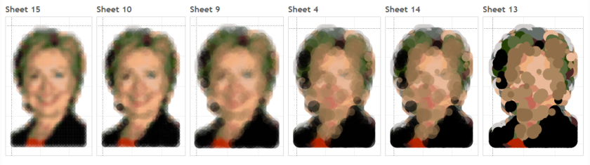
From there, I was able to blend each bin with the corresponding bin of the coordinate plane I was using for the primary interaction. It takes a bit of fiddling, but in the end it’s essentially just sheet swapping based on a filter action that triggers on select.

The grids were built by finding the average/median of each measure (whichever made more sense with the data source) and plotting them on the xy plane. I made sure the bins were approximately equal between candidates, but weighed certain information more heavily. As you can see above, guessing in the right quadrant would get you a more positive result than a “closer” guess in the wrong quadrant (I considered each 0 axis as a tipping point) and guessing one measure correctly would be considered “half right,” even when it’s only a few marks away from “cartoonishly inaccurate.”
If there’s interest (…even if there’s not), I expect to make a much more detailed tutorial of this in the near future.
As I discuss a little more below, these grids and the distortion view were both backed by data, but ultimately created by a subjective author and only meaningful with personal reflection. I kind of imagine the process where you’re clicking around trying to feel your way toward the most accurate point as a space to interrogate not just the the gap between what you perceive and the view you’re seeing, but the data beneath the view, and my own role as the author of the dashboard.
The Rotating Quote
A small detail I’m rather fond of is the rotating quote at the top of the page. I used Joshua Milligan’s random number generator, which mashes up Microsoft Visual Basic with the NOW() calculation, to give you a new result every time you refresh (in theory. In practice it looks like there’s a cache the server will use for awhile). I assigned the variable to the text and used RANK to pull just a single quote. It’s not half as complicated as the process above, but I hadn’t seen much discussion of random numbers except as a proof of concept, so I was pleased to work this one out.
Everything Else
Because the central visualization was so complex, I wanted to rely on very simple visual encoding for all the supplementary data. The grids themselves are sparsely designed – kind of inspired by Nolan charts. Bar charts, line graphs, and scatterplots pop up beneath the top view as soon as you make a selection, which allow you to view the underlying statements with a click (full text and ranking on hover). Also available is some information about the data, it’s limitations and interpretation, and its sources. If the underlying theme of last week’s Information + Conference hadn’t been “foreground the underlying complexity and messiness of data – for justice!”, I might have favored a cleaner look, but once you bring up data literacy to a librarian…
Anyway, I was definitely grateful to have hit on “newspaper” as a design theme early, because the small font and short columns ended up being absolutely necessary to fit it all in.
I knew exposing the actual data feeding each dashboard was essential to understanding and interpreting your result, but after showing it to a few friends early in the process, their primary comments were about finding and looking into the underlying statements made by each candidate (and the snarkiness of the Politifact comments) – another heartwarming information literacy moment.
On Distortion and Subjectivity
As someone who is building a career on data literacy and visualization, I can’t help but feel a little uneasy submitting for critical review something in which the encoding is so subjective and the primary data sources have been manipulated to the point of near unrecognizability.
In defense of distortion, I want to quote Tamara Munzner, who says “distortion is less problematic with familiar shapes, like geographic maps of known places, because people can interpret the distortion as a change to a known baseline.”² Although she is talking more specifically about fisheye lenses and cartograms, the iconography of this year’s presidential candidates are incredibly pervasive, and I believe they provide a recognizable baseline from which some approximation of difference can be measured. Especially when, as I’ve been repeating to myself throughout this process, “it’s all so subjective anyway.”
And as to that subjectivity – this dashboard hangs on the premise that perceptual distortion can be quantitatively measured and visualized. I’m not confident in that stance in a scientific way, but I think the value in a more subjective approach is that the meaningful differences and relationships between categories are the ones identified and interpreted by the user. Political discourse in particular can run in deeply entrenched ruts, and questioning a result and having the opportunity to learn more is a process I hope might be less prone to instinctive hostility. Curiosity before defensiveness, perhaps.
In the end, this is as much a rhetorical project as it is a visualization. It’s certainly not free from bias, and while I’ve used widely-available political data to support the results, I deliberately foregrounded subjectivity and emotional language (not “the median value of Hillary’s statements when ranked from most to least truthful” but “honesty”) for effect. I really enjoyed working on it. I hope you like it too.
Click here to view the visualization on Tableau Public.
References
¹ It’s a political election, and there is record-breaking antipathy between parties, polarization, and dislike of both candidates.
² Munzner, Tamara. (2014). Visualization Analysis and Design. A K Peters Visualization Series, CRC Press.

2 thoughts on “Tableau Politics IronViz 2016”