
When I was earning my MLIS from UBC, I took a Teaching and Learning Enhancement-funded (TLEF) position to work with Katherine Miller on revising the Land and Food Systems Information Literacy Tutorial. We developed a Choose Your Own Adventure-style tutorial module to assess students’ familiarity with certain tools and resources and to inform decisions about the ongoing development and sustainability of the tutorial and its integration with LFS course content.
This format was chosen because it was not intrusive, largely enjoyable to students, and flexible – giving students additional help when desired and skipping ahead to more relevant content when it was not. Building the tutorial in a survey platform provided rich insight into the decision-making of students during the research process, which allowed us to revise the format of the tutorial and switch over to a more sustainable tool going forward.
We suggest this kind of gamification as less invasive and more informative alternative to pre- and post-testing, which merely tests recall of information, puts a significant time and effort burden on students, and offers only limited utility to the librarians responsible for developing and maintaining the content. Embedding Choose Your Own Adventure-style content in a more traditional/linear tutorial can give you a balance of assessment and sustainability, and help serve students with a variety of different learning styles.
Links:
- ACRL-OR/WA Slides
- WILU Video
- Tutorial Module in FluidSurveys
- Tutorial Module in Twine
- UBC LibGuide
- Interactive Dashboard in Tableau
Want a template for your own work? Download the Twine File as using Save Link As to save the file to your computer. To modify or edit the content, visit Twinery.org on your own browser and import the file. This tutorial is licensed with Creative Commons Attribution Share Alike.
Thinking about making your own from scratch? Learn from our trials and errors and check out the overview of key tools below:
Tools Overview
Narrative Development Tools
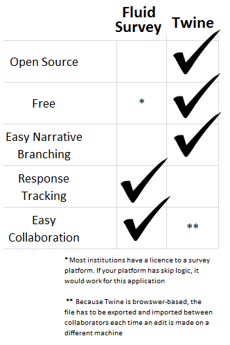
Twine is a free, open source tool built for Choose-Your-Own-Adventure-style branching narratives. It’s one of the easiest tools to manage, track, and revise the various content paths you develop, and the simple [[double bracket]] branching makes it an easy drafting tool, as well.
However, Twine does not have any tracking ability built into the program. There are instructions for using Google Analytics as a tracker here, but even with the ability to track clicks, the data is fairly complex and difficult to interpret.
Twine can also be used as a rudimentary visualization tool, as it allows you to zoom out to a structural-level view of your content as your drafting. This creates a node-link visualization that you can manually arrange without having to create each box and link by hand (as with Excel or Tableau).

- A brief tutorial on Twine is available here.
Survey Tools
FluidSurvey was the survey tool supported by UBC and has robust tracking and embedding capabilities, as well as the ability to easily copy surveys, collaboratively write, and customize URLs. However, any survey tool with “skip logic” or branching functionality, which makes questions appear and disappear based on user selections, could work for this kind of project. However, the conditional rules quickly become complex to navigate, and it’s very hard to draft within the survey tool itself.
Quest is an interactive fiction tool that is designed for exploratory environments, rather than a directed path. For example, in Quest you build a room with objects in it (a library with a book) and users have a text-based game (“pick up book”, “look at book”, “read book”) for which you have drafted various responses.
Visualization/Analysis/Reporting Tools
As far as I know, there are no “out of the box” tools to work with this kind of data. A list of the analysis and visualization tools we used in this project are described below, but all take a fairly significant degree of effort before you can find insights in the data.
In Tableau, we were able to create an overview of the tutorial structure that would provide the text of each node on hover and show the different paths through the content. The template was labor intensive to create, but allows you to filter the results, orient yourself within the content, and see the overall user response to the module.

The initial dashboard template was designed as part of Tamara Munzner’s Information Visualization Fall 2015 course. A copy of the final paper explaining and rationalizing the visualization choices in the dashboard above is available online here.
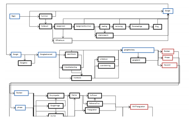
Excel
The first attempt to visualize the LFS CYOA tutorial was made in Excel. The image below is a screenshot of the flowchart we designed to understand the various paths through the tutorial. This was hand-created and arranged using the shapes and arrows tools.
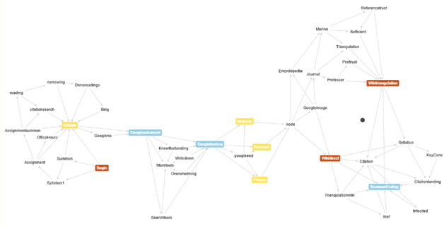
This was a force-directed algorithm available online that uses a two-character arrow -> to connect the points on a node-link graph. Nodes can be color coded, as below, and manually or automatically arranged (and the amount of “gravity” and attraction/repulsion between nodes can be adjusted dynamically). However, this layout was also not very intuitive, as users experienced the narrative linearly, even if we did not design it that way.
Additional Resources
Interactive Fiction Database: A catalogue of Interactive Fiction/Choose Your Own Adventure-style games available to play online. To narrow the range of possibilities, check out this Top 50 list, past winners from the annual IF Competition, or XYZZY Award winners.
One Book, Many Readings: Beautiful analysis of printed CYOA books that offers some insight into the structure of CYOA narratives and is an enjoyable read in its own right.
Standard Patterns in Choice-Based Games takes a closer look at the structure of interactive narratives.
Choice Of Games offers Choose Your Own Adventure-style narratives in ebook form (Choice Of the Dragon is personally beloved). They have two posts (here and here) about their format that are worth checking out.
While none of these offer a step-by-step guide to the dashboard above, there are two Data+Science posts on Sankey Diagrams (here and here) and a post at Clearly and Simply on Network Graphs (here) that were essential in putting together the Tableau visualizations.
